How to make templates
What is a template?
A template is a show that can be reused by changing the text(s) and/or the picture(s).
The challenge is to design effects that look good no matter which texts and pictures are used. A good template can save you a lot of time because you do not have to worry about the visual details when updating the content. This is especially important when using dynamic content.
This page gives tips and tricks for creating BluffTitler templates.
10 tips to make your intro video templates more effective

1) Design basics
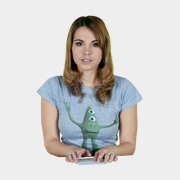
The title in this screenshot can't be simpler: a flat, not lightened, not textured 2D text. But it has 5 properties: background colour, text colour, text position, text size and font.
Have fun playing with hot 3D techniques, but never forget the basics: colour, composition and font.
2) Tell a story
Every story needs a beginning, a middle and an end. This is true, even for something as short as an intro video.
This can be as simple as: the text flies in, holds for a second and flies out.
The purpose of the beginning is to draw attention: to make sure the viewer continues watching. The purpose of the middle is to communicate the message. And the purpose of the end is to prepare the viewer for the real start of your video.

3) Keep it short
Always remember that a title is only a title.
The duration of the title depends on the duration of the total video. A 3 minute intro is perfectly OK for a 3 hour full featured Hollywood production, but for a YouTube or social media post, 3 to 12 seconds is usually sufficient.
4) Moods
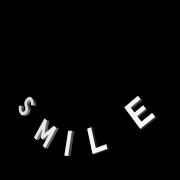
Remember that stories have moods. For example happy, sad, excited, serious or fun.
In titling, you set the mood by adjusting the speed of your elements, choosing appropriate colours, lighting, fonts and graphic elements.
5) Staging
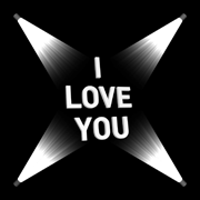
A template is successful if it communicates the intended message and mood.
The dynamic text and/or picture is the focal point. Direct the viewer's attention to this. The purpose of everything else is to support this message. Avoid unnecessary detail.
6) Legibility & readability
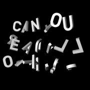
Looking good is not good enough. Make sure your characters (legibility) and texts (readability) are clearly visible and recognizable. At least at one significant moment during the show. Make sure that this moment is long enough or frequent enough for the viewer to comfortably perceive the message.
But don't overdo it. You can do 2 or more fast zooms/pans on the same text. But doing 2 slow zooms/pans on the very same text will bore the viewer.
7) Semantics
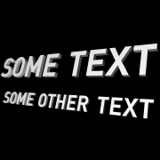
Instead of using meaningless or very specific texts it is better to use texts like:
YOUR NAME HERE
YOUR TITLE GOES HERE
Your subtitle goes right here
Your Awesome Slogan Goes Right Here
WWW.YOURWEBSITE.COM
For outros you can use texts like:
Thanks for watching!
Be sure to comment, like and subscribe
Don't forget to like, comment and subscribe
Also check out my facebook page at facebook.com/yourfacebookpage
Check out our website at www.yourwebsite.com
This tells the template user which texts are editable and how they can be used. Also, keep in mind that when you capitalize texts, it suggests to the user that it is a good idea for him or her to do so as well. Use capitalization in a meaningful way to help the user decide what works best in the template.
Pictures can say:
YOUR LOGO
YOUR PHOTO
YOUR LOGO/PHOTO

8) Aim for the largest audience
Every company has a name, a slogan and a website. If your template features those 3 texts, it can be used by all companies:
1 YOUR NAME HERE
2 Your Awesome Slogan Goes Here
3 WWW.YOURWEBSITE.COM
As a 4th element you could add a logo. A transparent square picture works best as a placeholder.

9) Use long texts
Short big texts can be a good way to show off your amazing textures and effects, but most template users are looking for templates with longer texts.
Make sure your templates look good with titles between 5 and 15 characters and subtitles with 20 to 30 characters. This cannot be overstated. If your title only has 2 characters, your template will not be useful to most users.

10) Test your titles
After working for an hour or longer on the same title, it's impossible to have a fresh look at it.
Take breaks regularly and show your work to your colleagues, friends and family.
5 BluffTitler techniques that make your templates handle any text and picture

1) Set the max text width
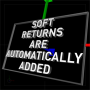
The text layer features a Bounding box property. The bounding box can be made visible by pressing <F2>. With the 1st slider of this property you can set the maximum width of the text. If the text is wider, it is automatically squeezed to make it fit.
This way you prevent texts from falling off the screen or penetrating other elements.
2) Set the max text height
With the 2nd slider of the Bounding box property you can set the maximum height. BluffTitler automatically adds soft returns to fill the space.
This way the template user does not have to enter hard returns.

3) Set the max image width and height
The size of the picture layer does not depend on the resolution of the picture. Every picture layer is scaled to the same height. The width depends on the aspect ratio.
Just like the text layer, the picture layer features a Bounding box property. With this property you can set the size of the rectangle.
This way you prevent pictures from falling off the screen or penetrating other elements.

4) Use the right alignment
You can right align a text by adding spaces at the beginning of each line. A much better way is to use the Right composition mode.

5) Set the circle radius
When using one of the circle text compositions (1st dropdown below the textbox), the radius depends on the Font size property, the Spacing property and the number of characters.
An easy trick to make the circle bigger is to add spaces at the end of the text. A much better way however is to use the Bounding box property to set the radius. This way the radius is independent of the text.
4 effects that make a good show, but a bad template
1) Circular logo
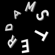
Some texts offer unique possibilities. For example, "AMSTERDAM" starts and ends with "AM". This observation can be used to create a nice circular logo. This effect however loses its edge when the text is changed. For this reason it is not a very good template.
2) Target O
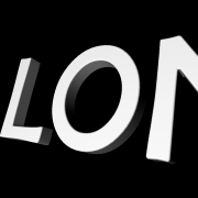
Letting the camera fly through the opening of the O (the "counter" or "aperture") or letting a ball fly through this opening is a very nice effect. But what if you change the text and an X is standing at that position?
This effect produces a good show... and a bad template.

3) Text on text
Writing a text on another text is a very nice effect. But what if you change the big "L" in this example into a "T"?
This effect produces a good show... and a bad template.

4) Tech demo
A tech demo is a show that demonstrates a particular technique, for example reflection mapping. A good tech demo looks spectacular, but rarely makes a good template.
The purpose of a template is not to show the world your 3D skills. Imagine yourself in the position of the template user and try to understand his/her needs.
Filenames
| DO NOT | DO |
Do not use spaces | |
| Flare Red.jpg | Flare_Red.jpg |
Use English names | |
| Blauw.jpg | Blue.jpg |
Limit yourself to A-Z, a-z, 0-9 | |
| Título.jpg | Title.jpg |
Group related textures by using the same naming system | |
| Flarered.jpg greenflare.jpg flare_Blue.png flare YELLOW.tga | Flare_Red.jpg Flare_Green.jpg Flare_Blue.jpg Flare_Yellow.jpg |
Use descriptive names | |
| 34632.jpg | Flare_Red.jpg |
Do not use texts like "test", "experiment", "attempt", "try", "lab",... | |
| Test23b_Experiment12.jpg | Cloud.jpg |
If it is a reflection map, add the string Reflectionmap | |
| black.jpg | Reflectionmap_Black.jpg |
| See the full list of all the effect/filename associations BluffTitler uses | |
Do not use the same file twice using another name | |
| Flare_Red54a.jpg Flare_Red67b.jpg | Flare_Red.jpg |
Add your initials | |
| For files that are copyrighted by you, use your initials as a prefix: | |
| Flare_Red.jpg | EH_Flare_Red.jpg |